MCF Fast Badges
MCF Fast Badge is a feature that displays delivery estimate message on the product detail page, accompanied by an order cutoff timer and a zip code selector. Fast Badges allow shoppers to see when they can expect delivery of an item while on the product detail page, and influences them to add the item to their cart while on the product detail page.
UI options
 |
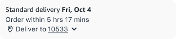
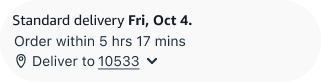
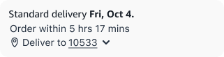
Full variant: Displays delivery date, order cutoff time, and location to set clear delivery expectations and drive urgency. |
 |
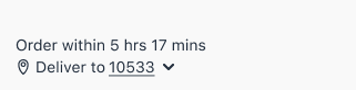
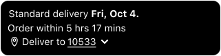
Compact variant: A streamlined version showing only the delivery date and zip code for a lighter footprint in dense layouts. |
Placement
Product detail page
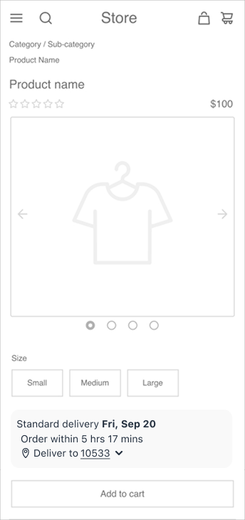 |
Above the ‘Add to cart’ button: Position the MCF fast badge near the call-to-action to influences shopper behavior by highlighting fast delivery at the point of decision, encouraging cart building and conversions. |
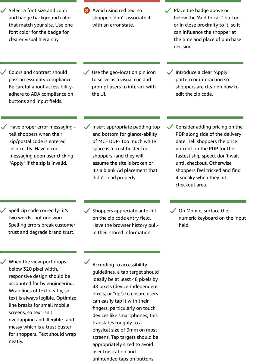
Dos and don'ts
Component states
State variations define how a UI component adapts based on user input, validation rules, or system feedback. These variations ensure consistency and clarity, whether it's a zip code field adjusting for formatting errors or an input field responding to focus and interaction.
Zip code states
This section outlines the different states of the zip code field, including the default state, expanded view, value input, and error handling.
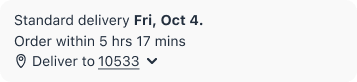 |
Default: Displays zip code collapsed |
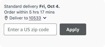 |
Expanded: Displays zip code expanded |
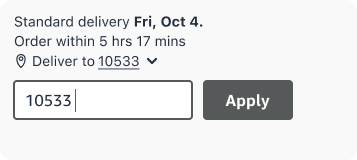 |
Value input: Displays zip code entered |
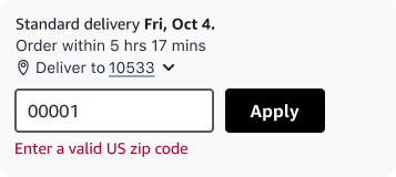 |
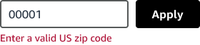
Error: Displays error messaging |
Location code message options
Based on the merchant’s region or locale of operation where they serve shoppers, select an appropriate format to present the postal codes.
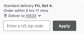 |
United States: Displays a prompt for users to enter a valid five-digit zip code. |
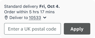 |
United Kingdom: Displays a prompt for users to enter a valid UK postcode, which may include letters and numbers. |
Input field states
This section outlines the different states of the zip code field, including the default state, expanded view, value input, and error handling.
 |
Default: Stroke 1px, #6C7778 |
 |
Focused: Stroke 2px, #565959 |
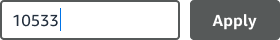 |
Focused and filled: Stroke 2px, #565959 |
 |
Apply pressed: Stroke 2px, #565959. Red text #AD0A30 |
 |
Filled: Stroke 1px, #6C7778, Text is #232F3E |
 |
Dark mode/error state: Stroke 2 px, #565959, Red text is #EA0B3F |
Design guidelines
Design options are available to customize the card’s appearance, ensuring it aligns seamlessly with your site’s style and enhances user engagement with tailored messaging.
Font and size
The font/size section in the component library allows users to customize typography to match their site’s design. Use a clean, legible font like sans-serif for modern designs and maintain consistent sizes. For example, use 14px for body text to ensure readability and visual hierarchy.
Corner radius
Adjust the corner radius to align with aesthetic on your site.
 |
Square: Sharp, right-angled corners with no rounding. Use for a more professional, formal, or crisp look. |
 |
Rounded (12 pixels): Partially rounded, strikes a balance between square and fully rounded. Common for modern sites. |
 |
Pill (40 pixels): Fully rounded, radius container. Use for key actions, floating buttons, or an approachable, modern aesthetic. |
 |
Custom (12 - 40 pixels): Choose your corners to match other containers and buttons on your site. Corner radius ranges are from 12-40px. |
Container colors
You can customize the design appearance and color of the background container surrounding the MCF Fast Badge.
 |
Default: A soft, light gray background that subtly separates content from the page background while maintaining a clean, minimal aesthetic. |
 |
Transparent: No background color applied, allowing the container to blend with the page or inherit the parent background. Ideal for layered or minimalist designs. |
Light or dark mode
Adjust the component's appearance to match the system or user preference, ensuring optimal readability and visual comfort in different lighting environments.
 |
Light: Uses a white background with dark text for a standard appearance. |
 |
Dark: Features a black background with light text and outlined elements for better visibility in low-light settings. |
Responsiveness
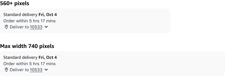
Widget width ranges from 300-740px.