Buy with Prime button
The Buy with Prime button signals a consistent, trustworthy experience for Prime members. Displayed on Prime-eligible products, it enables express checkout by letting shoppers sign in to their Amazon account and use their saved shipping and payment details. The "Add to Cart" Buy with Prime button lets shoppers add Prime-eligible products to their Prime cart for purchases of multiple products.
Button options
Buy with Prime express checkout
 |
With delivery date: Use when the product is eligible for Prime. This can be displayed based on stock levels and shopper location. Displays delivery estimate. |
 |
Without delivery date: Use when the product is eligible for Prime and there isn’t space to include the date. |
Buy with Prime Widget
 |
Add to Cart with delivery date: Use to add the item to the shopper's cart when the product is eligible for Prime. This can be displayed based on stock levels and shopper location. Displays delivery estimate. |
 |
Add to Cart without delivery date: Use to add the item to the shopper's cart when the product is eligible for Prime and there isn’t space to include the date. |
Placement
Button with delivery date, Without delivery date, and Cart & delivery date
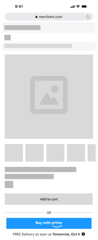 |
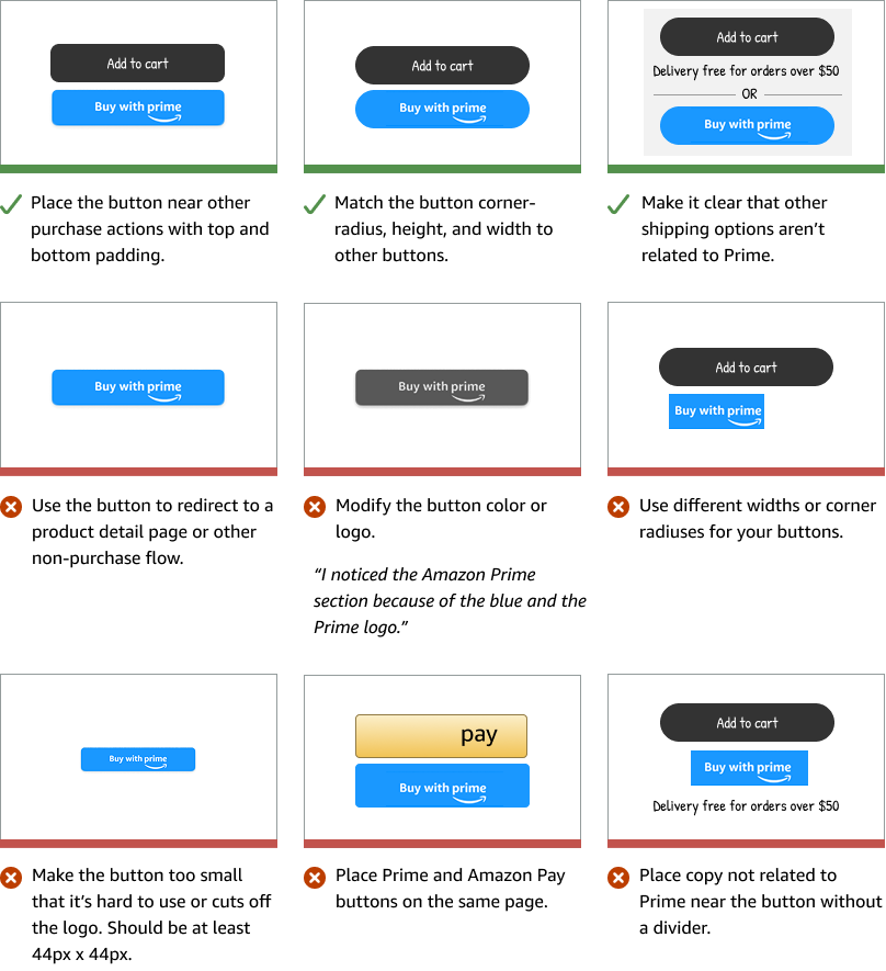
Place directly above or below primary button: Within 30px of your Add to Cart button. Near product info: Encourages immediate action and reduces friction. Consistent positioning across devices: Helps users quickly locate the call-to-action, regardless of device type. Minimum 12px margin between the call-to-actions: Ensure that padding is aligned with other button spacing on the remainder of the product detail page. Delineate between call-to-actions: Use an "OR" divider to make it clear to shoppers that they can choose your checkout or a Prime checkout. |
Dos and don'ts
Design guidelines
Design options are available to make the Buy with Prime button match the look and feel of your site.
Corner radius
Adjust the corner radius to align with other buttons on your site.
 |
Square: Sharp, right-angled corners with no rounding. Use for a clean, crisp appearance. |
 |
Rounded (10px): Partially rounded, strikes a balance between square and fully rounded. Common for modern sites. |
 |
Pill (25px): Fully rounded, radius at 50% of button height. Use for key actions, floating buttons, or an approachable, modern aesthetic. |
 |
Custom (26-50px): Choose your corners to match other buttons on your site. Corner radius ranges are from 26-50px. |
Display themes
Light and dark mode are display themes that adjust the background and text colors to optimize visibility and comfort in different lighting conditions.
 |
Light mode: The Buy with Prime blue button with white text is designed for clear visibility against a light background. |
|
Dark mode: The Buy with Prime blue button with white text on a dark background, enhances contrast and readability in low-light environments. |
Responsiveness
Widget width ranges from 300-740px.