Accessibility
Design for all
When offering Buy with Prime on your website, it’s important to make sure that all of your design and content is accessible to all shoppers. An accessible website is designed so that all shoppers, including people with disabilities, can use it. To ensure your website is accessible, review the Web Content Accessibility Guidelines (WCAG), and apply them to your website. These Guidelines below are a starting point based on WCAG and can’t guarantee your online store is fully accessible.
Best practices
Provide text alternatives for non-text content
Alternative text provides context to customers using screen readers with non-text content (like images, icons, or illustrations). Screen readers make image content and functions accessible to those with visual and certain cognitive disabilities.

Do
Use alt text. For example, alt text for the above image could be “Man handing customer a package.”
Don't
Omit alt text, or use alt text that includes “photo of” or “image of”, e.g. “Photo of a man handing a customer a package.”
Make all functionality operable by a keyboard
All content and functions of your website should be operable via keyboard alone. Ensure your page navigates in the logical tab order, and that no ‘keyboard traps’ are observed. Learn more.

Do
Empower the shopper to navigate your site by keyboard, and indicate where the keyboard is focused. Use a logical tab order so shoppers can understand your experience while navigating with a keyboard.
Don't
Create accidental keyboard traps that users can't navigate out of.
Make text readable and understandable
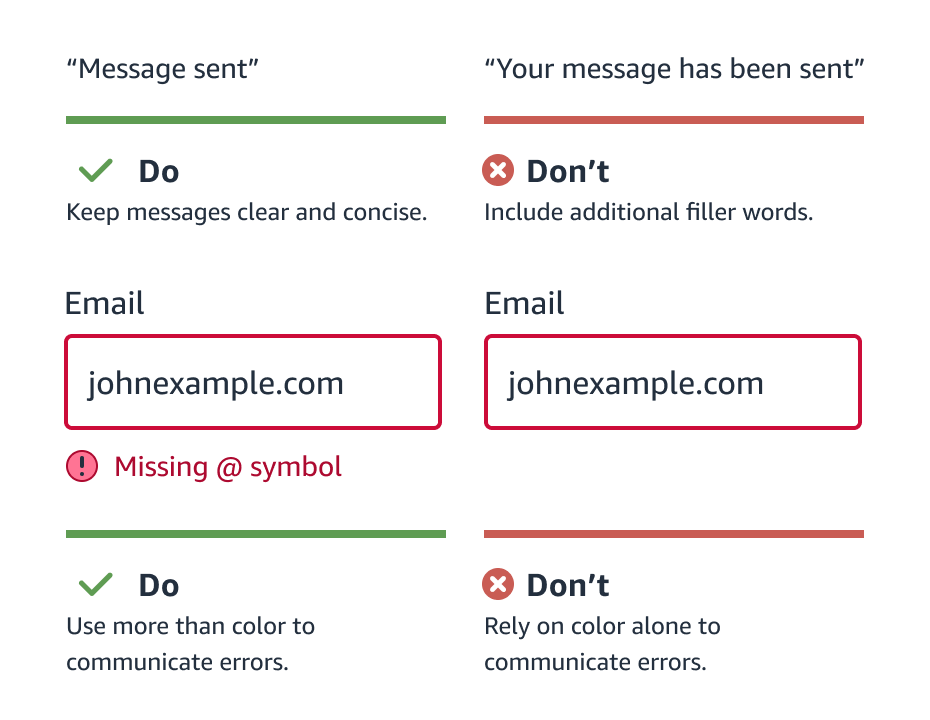
Use language that is concise, specific and direct. Consider all reading levels and when it’s appropriate or not to use abbreviations. Make sure the text is large enough to read. Don't rely on color or text formatting alone (i.e., bold, italics and underline) to convey meaning, as context may not get communicated to color blind and/or screen reader users.

Color contrast
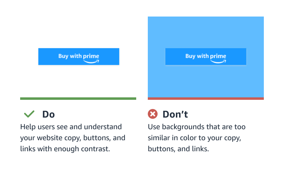
When selecting colors for UI elements like fonts, links, backgrounds, buttons etc., make sure that it’s visible to customers who are visually impaired. You can use a contrast checker tool to check the contrast of the colors you’ve selected.

Accessibility principles
Use the following accessibility principles to evaluate whether you are creating accessible experiences for shoppers.
Perceivable — This principle includes guidelines such as providing text alternatives for non-text content. For example, you should have “alt text” for product photos to accommodate for blind or vision-impaired visitors.
Operable — This principle says you should ensure your site is effectively used by all people. For instance, a user should be able to reasonably navigate your site using just their keyboard (without a mouse).
Understandable — This principle states (among other things) that your site should be rendered in such a way that things like the language used can be programmatically determined (by browser accessibility plugins and other tools). It also suggests that a site should behave predictably. For example, merely changing focus on a part of a page doesn’t cause unexpected changes to the content.
Robust — According to this principle, content should be implemented in a way that it can be interpreted reliably by assistive technologies. Basic adherence to this guideline includes having valid code markup so the content can be parsed by a machine.
More resources
To check the accessibility on your website, consider the following resources.
Accessibility Fundamentals
Web Accessibility Evaluation Tools
Accessibility Evaluation Toolkit
Accessibility Checklist
Updated over 2 years ago